Building a simpler way to move money
Overview
A P2P transfer product for US banking customers that made sending money between banks as simple as using a recipient's phone number or email. I helped define the product from the ground up, shaping its interaction model, visual language, and the relationships between its different perspectives.
Industries
Year
2022

The problem
Moving money shouldn't require knowing someone's bank
DCI provided internet banking infrastructure for banks across the US. While its customers could already transfer money, sending funds to someone at another institution was complicated, slow, and required too much information.
The opportunity was to create something closer to the simplicity of Pix (Brazil's instant payment system): send money to another person using an identifier they already know, without needing to know their bank.
The resulting product had three connected experiences:
Sender — initiate a transfer from an existing bank account
Receiver — securely receive the money through a dedicated product
Admin — manage users, transfers, notifications, and exceptions
My role
I worked across UX, UI, visual identity, naming, and prototyping. I mapped the core flows with the team, translated technical constraints into user-facing states, created the visual language and design system, and built the navigable high-fidelity prototype.
This work happened across overlapping stages rather than as a strictly linear process. I started by defining the product's visual identity and naming while simultaneously working with the team to understand its rules, flows, and technical constraints.
From a banking feature to a product
The sender experience lived inside the bank's existing interface, while the receiver needed to interact with a completely new product.
That created an unusual design problem: how do you make a new financial product feel trustworthy enough to handle someone's money, while still feeling dramatically simpler than traditional banking?
This became the foundation for both the product experience and its visual identity.
Establishing the visual language
The product needed to feel modern and approachable without losing the trust expected from a financial service.
I explored different territories around the ideas of trust, safety, speed, and simplicity, looking for a balance between a contemporary digital product and the familiarity of financial services.

Grouping the concepts that could define the product's visual territory
The resulting direction was intended to feel:
Modern without feeling young.
Trustworthy without feeling traditional.
Simple without feeling simplistic.
The research and exploration eventually narrowed the brand down to a few core ideas: safe, quick, simple, easy, differentiated by trust, partner, familiar, with the positioning “Safely pay anyone.”

Reducing the brand strategy to a clear visual foundation
I translated these principles into a visual direction that balanced the familiarity expected from financial products with a lighter, more approachable character.

Reducing the visual identity to the concepts of safe and easy

Visual references exploring trust, simplicity, modernity, and safety
The visual language was intentionally restrained, using a small set of colors and typography to keep the interface clear and recognizable.

Dark blue anchored the identity in the trust and familiarity of traditional banking, while vivid green pushed it toward the energy and modernity of fintech
Creating Payzee
The name needed to communicate what the product did while remaining approachable and easy to remember.
I explored naming territories around ideas such as sending, payments, money, and transfers before the team selected Payzee.

Exploring combinations around the core ideas of sending, money, and payments
The name Payzee emerged from this exploration alongside alternatives such as Sendast, Sendasy, Monaze, Payasy, and Payfle.
The identity followed the same principle: a simple, recognizable visual language that could make moving money feel less intimidating.
The symbol united three ideas: a physical credit card, a swipe action, and a form suggesting an arrow. Together, they represented a familiar payment method combined with the speed and simplicity of a digital interaction.

Combining the familiarity of a card with the simplicity and movement of a digital swipe

Turning the concept into a product
With the visual direction established, I translated the concept into three connected experiences. The focus was on establishing a consistent model for how a transfer moves through the system, from initiation to completion and everything that can happen in between.
Designing the transfer flow
A receiver shouldn't need to become a user
The receiver experience was the first interaction many people would have with Payzee, so it needed to make the process feel straightforward from the beginning.
A receiver could accept money without creating a Payzee account. They could follow the transfer, provide their bank details, and choose how to receive the funds without going through a traditional registration flow.
Registered users could save their bank details and access their transfer history, while first-time recipients could complete the transaction as guests. The original product definition explicitly included this distinction between guest and registered users.
The goal was simple: receiving money shouldn’t require learning how another financial product works.
The sender experience
The sender experience had a different constraint: it lived inside the existing bank interface, so it couldn't simply adopt Payzee's new visual language.
The flow was intentionally focused around the information needed to complete the transfer:
Recipient → Amount → Shared word → Confirmation
The sender enters the recipient's email or phone, chooses the amount, creates a shared word, and confirms the transfer.
Rather than asking users for bank information, the sender could initiate a transfer using a phone number or email address.
This created a familiar mental model: identify the person, choose the amount, confirm the transaction.
One transaction, many possible states
The transfer wasn't simply a matter of sending and receiving money.
There were multiple possible outcomes: waiting, pending, declined, expired, failed, cancelled, frozen, completed, and on hold.
More importantly, these states could mean different things depending on who was looking at the transaction.

Defining the states that connect the underlying transaction logic to the user experience
I mapped these states across the sender, receiver, and admin perspectives so that the underlying transaction logic could translate consistently into the user experience.
These states had to reflect the underlying transaction logic and technical constraints, so I worked with the development team to define how transfers would behave before determining how each state should appear to users.

An operational interface for managing users, transfers, and notifications
Communicating what happens next
Once the state system was defined, I established how those states should be communicated through notifications and in-product messaging.
Each notification had a specific purpose: confirming an action, prompting the next step, warning about an expiring transfer, or explaining when something had gone wrong.
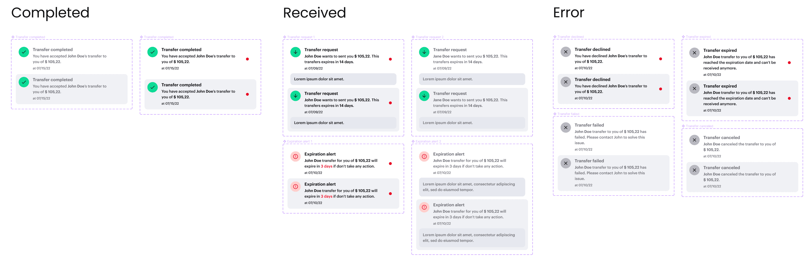
Notifications mapped to the different outcomes of a transfer
The goal was to make the system feel predictable even when a transaction didn't go as expected.
Building the visual system
Because the product spanned three different interfaces, the visual system needed to create consistency without forcing every experience into the same mold.
I organized shared components and patterns around the different perspectives, allowing the bank experience, Payzee receiver experience, and admin environment to feel related while remaining appropriate to their contexts.

Organizing the design system around shared and perspective-specific components
One system, fully connected
The final prototype brought the product together around a shared transaction model, connecting the experience of sending, receiving, and managing transfers.


Receiver mobile experience


Receiver desktop experience


Admin experience
What started as a simple idea — making P2P transfers easier — required designing the relationships between these three perspectives and the many states connecting them.
Payzee became a product where the interaction model, visual language, and underlying system were designed to work as one.